I did both the cover and the interior layout for this book. A professor was republishing a master’s thesis written decades earlier, accompanied by his long essay that updated and expanded on the thesis. The two together provide an interesting history of a well-known local meeting hall.
The Advantage of Well-written Captions
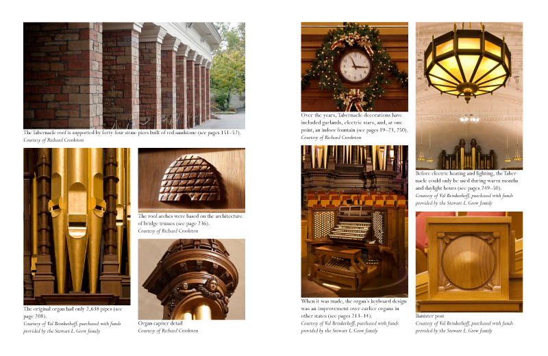
One of the fun challenges to this book was writing the captions. We knew many readers who saw this at a bookstore would pick it up and thumb through it, and photos and captions are some of the first places you go when first perusing a book. We took some of the most interesting, gee-whiz trivia from the main text and included that information in the captions. (For example, the fact that there was once an operating fountain inside this meeting hall, right down the front aisle, complete with water spouts.)
To increase the odds that a person would start browsing the book and take interest in buying it, I also suggested that we put a few multi-photo spreads at the very beginning, with additional captions that mention those little-known facts followed by an invitation “to read more, see page 147,” etc.
I also drew a small geometric image as a motif in the book, to appear on the cover, at the end of chapters, and in other places. I borrowed a circle-and-square pattern from some of the wood carvings inside the building. Because the book dealt a lot with architecture, I made it look like a hand-drawn pencil sketch that might appear on a blueprint or some drafting plans. You can see it on the book spine and front cover, just below the title.


